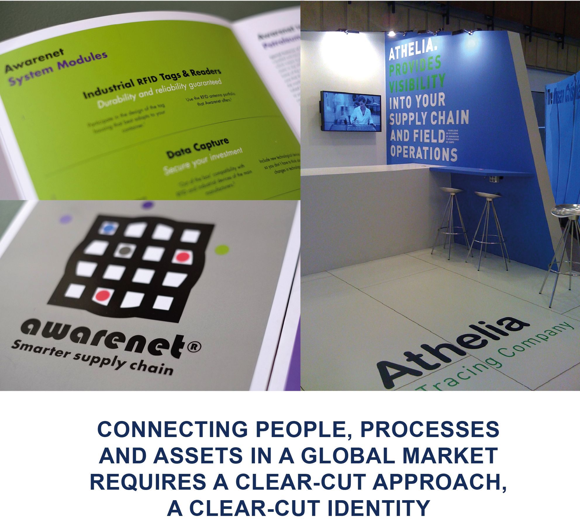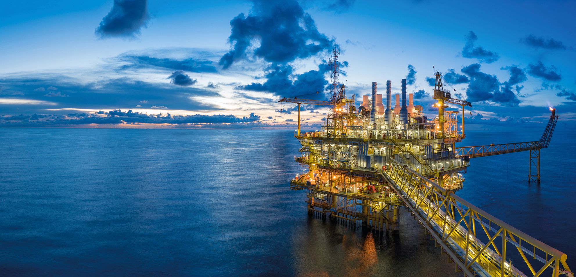
As leaders in offering software and hardware tools to implement logistical processes on a global scale, the newly formed company required a name and a clear brand definition. With offices around the world, the brand also required a global language to unify them all.
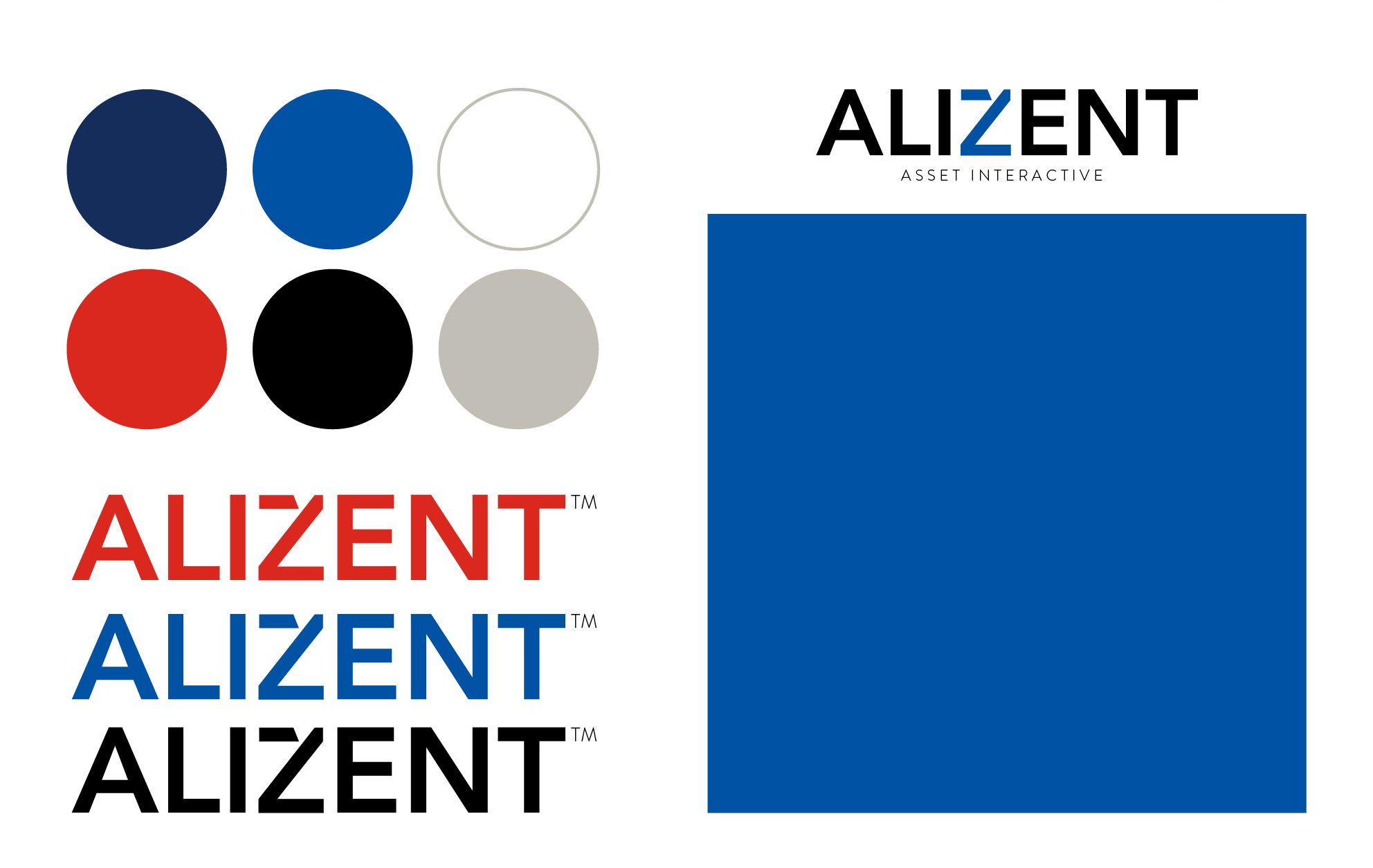
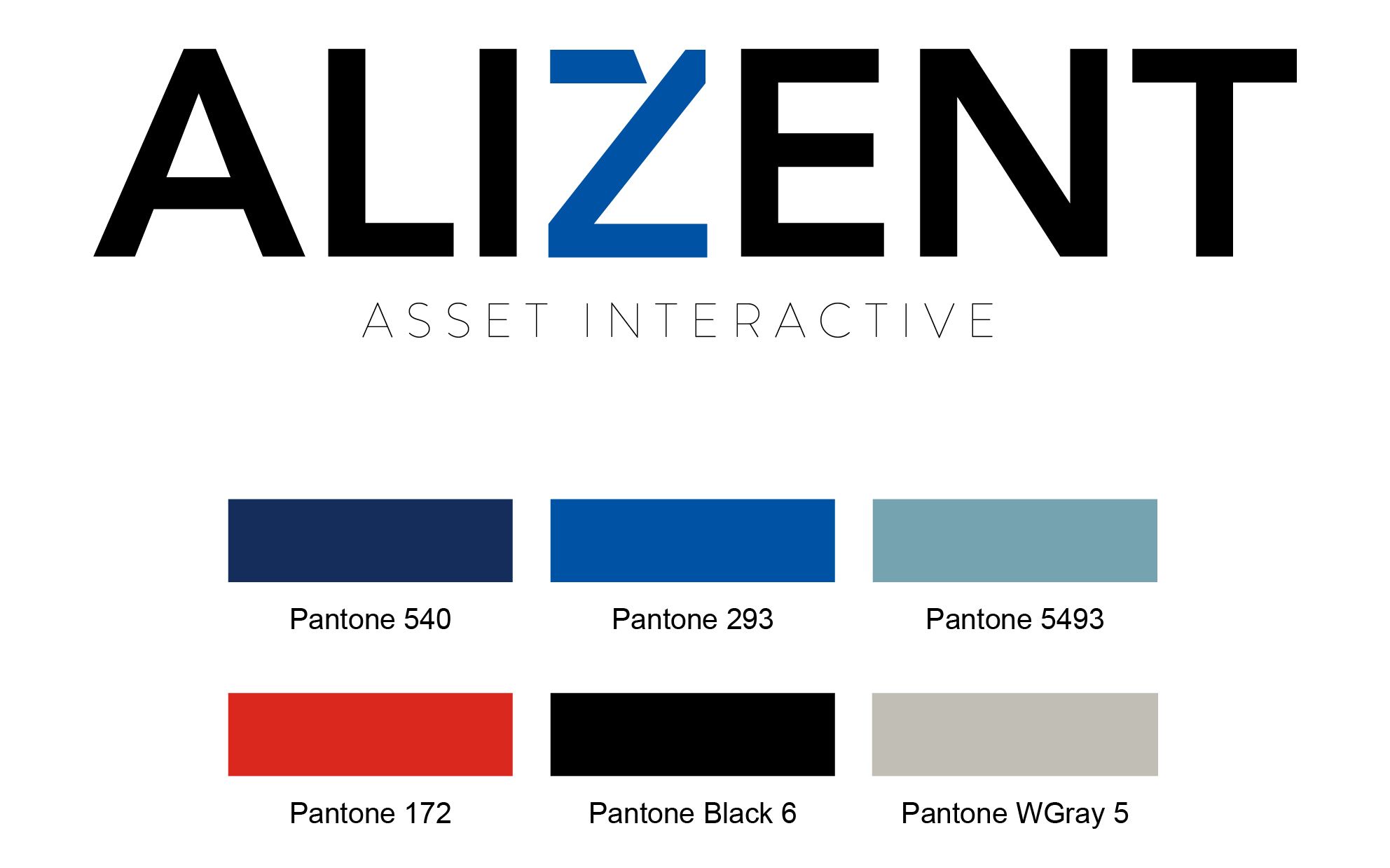
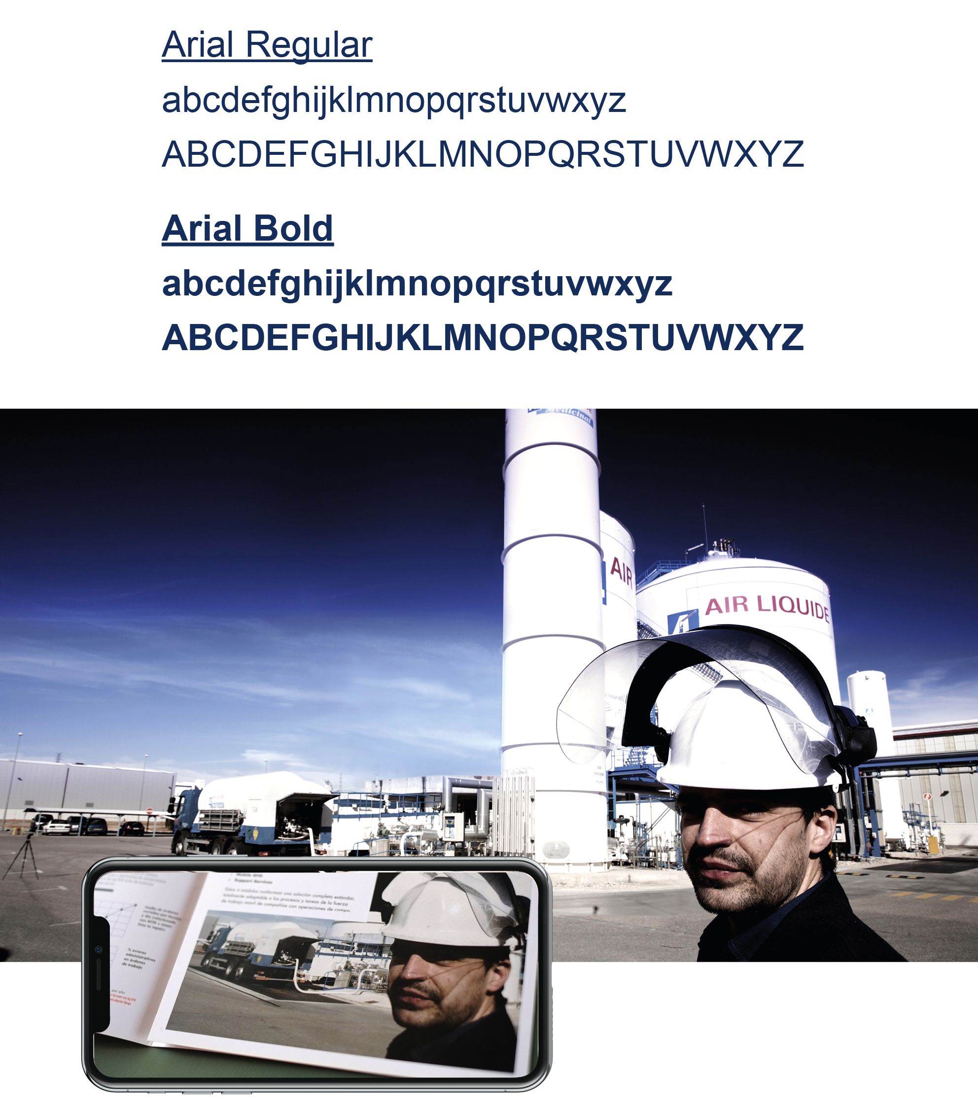
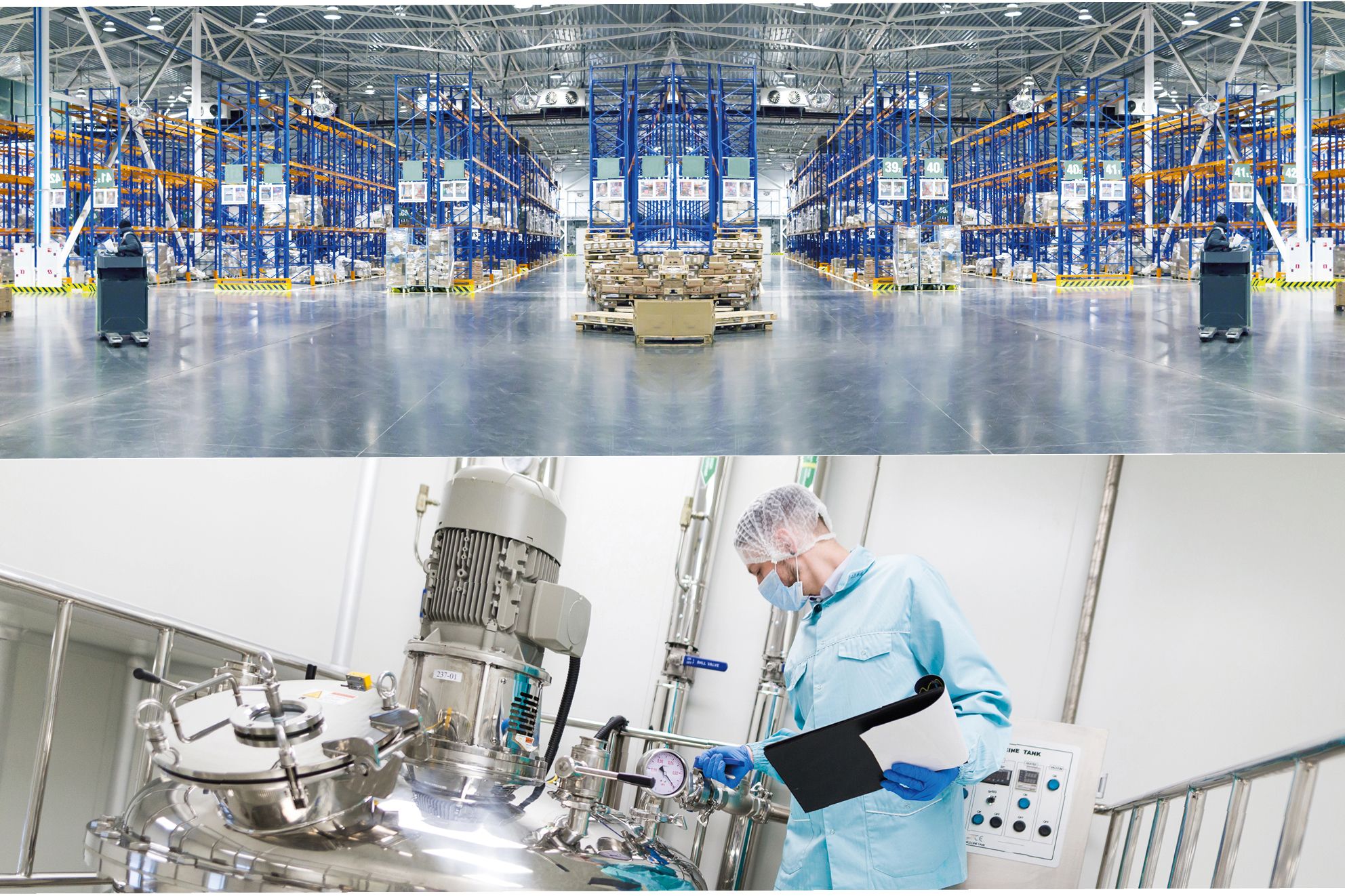
As a starting point, we used the initials of their mother company, the Air Liquide Group, and adding a more fluid sense to it with the naming - ALIZENT. The font Avenir served as a direct and clean corporate font. The color palette took inspiration from air-liquid itself, with the addition of earthy shades and warm tints. As part of the corporate communication package, we also created a series of animated icons and brochures to explain certain services and processes. Pictograms were generated to depict some of the main services the company offered. Picture galleries were curated to reflect the scale and visual characteristics of the technological and global aspects of the company. Besides the corporate communication tools, we also developed graphics for office interiors and trade fairs, a website, and guidelines for the software interface. The second tier to this project was naming and branding of the sub-parts of the products, such as Awarenet and Django. This project stands as a good example of a brand that has responded well to global use.